New logo (3 Viewers)
- Thread starter Tak!
- Start date
More options
Who Replied?
I can understand the idea behind the change, which is to expand our brand. However we can discuss its execution. Change is good if it is well executed.
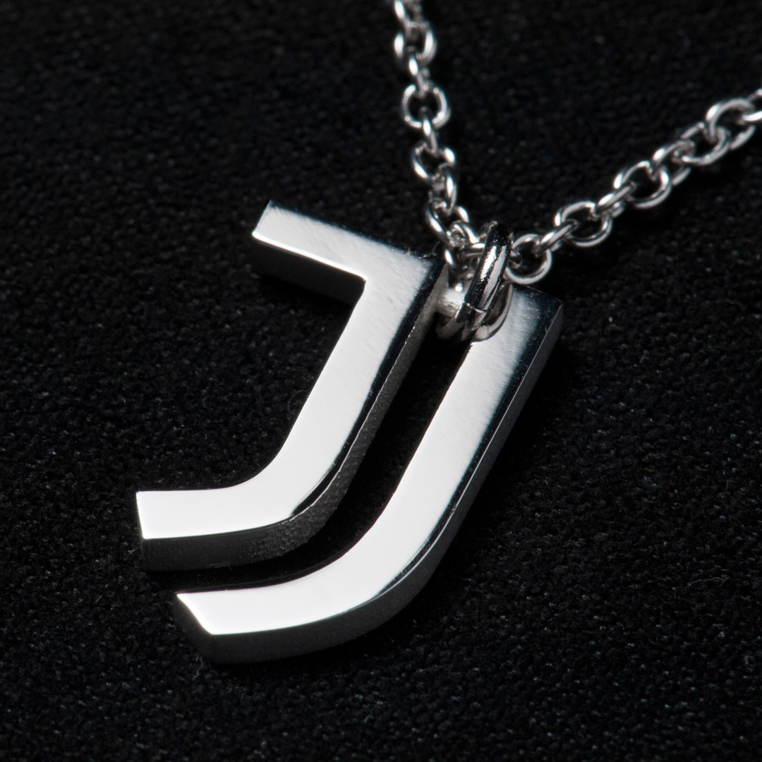
In this case, I like the idea of going for a minimalistic, simple design but I just don't like the Jj.
It would be interesting to see if Juventus expand their operations and essentially become an apparel manufacturer. It's a long term, large investment with a big payoff if successful.
Damn Pogba you had so much potential...
Jj winter collection by Pogba.

At the end of the day we'll all have to accept the change. And every single member here understands the intent of this change and how it will positively expand our brand but people complaining about people complaining get to be even more annoying.
It's a symbol of something we love that's being mutilated. Let us deal with it they way we choose to. It'll pass.
It's a symbol of something we love that's being mutilated. Let us deal with it they way we choose to. It'll pass.

After first thinking wtf is that, I like it now and totally get it. How many times have you seen someone out on the street wearing Barca, Madrid, United stuff and thinking "you look tacky as fuck." Only to go out yourself wearing Juventus stuff probably looking the same.  It's a genius move. I myself had a baseball hat made months ago with "JUVE" written on it in college block style font like how basketball hats do it so it could look okay.
It's a genius move. I myself had a baseball hat made months ago with "JUVE" written on it in college block style font like how basketball hats do it so it could look okay.


Its not just about the logo, in general it seems like we're slowly losing our identity and this is the most obvious symbol of this pop transformation.
The same people who complained about the logo in 2003 want the logo back now.
After first thinking wtf is that, I like it now and totally get it. How many times have you seen someone out on the street wearing Barca, Madrid, United stuff and thinking "you look tacky as fuck." Only to go out yourself wearing Juventus stuff probably looking the same. It's a genius move. I myself had a baseball hat made months ago with "JUVE" written on it in college block style font like how basketball hats do it so it could look okay.
It's a genius move. I myself had a baseball hat made months ago with "JUVE" written on it in college block style font like how basketball hats do it so it could look okay.
- - - Updated - - -
I've always wondered what that hideous crown and Bull in our old badge represent? Crown for King of Italy and Bull for Torino FC our arch rivals? Both hold no significance whatsoever to the Juve identity.