New logo (22 Viewers)

so?

  • Like it

  • Don't like it


Results are only viewable after voting.

Siamak

╭∩╮( ͡° ͜ʖ ͡°)╭∩╮
Aug 13, 2013
18,351
I know it's all fun and games with the people who think it's easy to make such a logo (or at least I hope so), but slightly refreshening our current logo would have been much easier and less time consuming than pretty much making a completely new one.
This is not even a logo In my opinion or at least not a club logo.it looks like a clothing or electronic equipment stuff brand.why they don't design a logo with zebra we have had zebra icon on all juventus logos.with this approach we just threw all our history away as i see every reactions everywhere is very negative because the fans are not satisfied with this decision.
 

Buy on AliExpress.com

PedroFlu

Senior Member
Sep 20, 2011
7,166
Folks like @PedroFlu also don't believe in evolution, dinosaurs, the solar system or other concepts that stretch beyond their localized consciousnesses and level of understanding

Brilliant stuff really
This as a pretentious comment as it gets. And because of that, stupid as hell.

If you can only see one side of the coin, you are as limited as the ones you consider to be in their "localized" small world.

You ignore the fact that while it may be great for future young kids, the average 40 + year Italian supporter will be very disappointed. They are the core of the club. There is a lot of people that will feel disrespected, and the fan base is the most important asset of any football club.

If you don't think there are risks involved in this move - that is very bold, indeed - and that there isn't another view that should be considered and respected, you are as ignorant as those you refer to.

This could be a genious coup or a huge embarassment that could end in 2 years, really.

The only think it isn't is an inevitable development as you imply, which isn't hard to understand when this is the most important/revolutionary rebranding in the history of football, and possibly of sport.
 

.zero

★ ★ ★
Aug 8, 2006
82,813
Another wonderful, myopic post

You ignore the fact that while it may be great for future young kids, the average 40 + year Italian supporter will be very disappointed. They are the core of the club. There is a lot of people that will feel disrespected, and the fan base is the most important asset of any football club.
Localized thinking as it gets. You obviously do not grasp the concept, goal of globalization and the acquisition of new diverse supporters that 'support' in more ways than filling the curva.

If you don't think there are risks involved in this move - that is very bold, indeed - and that there isn't another view that should be considered and respected, you are as ignorant as those you refer to.
All moves that person/business makes is a risk. The fact that you continue to feel that the change is not right is indication of your limited knowledge and understanding. Perhaps you should only stick to watching old matches of squads that make you feel reminiscent of a "simpler, better time" when 40+ yr old italian men sat in the stands and cheered on the club.

This could be a genious coup or a huge embarassment that could end in 2 years, really.
Yes, you're right. This has the potential to end horribly. It might end up in the club dissolving and a nuclear winter to follow. I fear the worst for the 40+ year old italians the most

Now run home and get your shinebox
 

Zacheryah

Senior Member
Aug 29, 2010
42,251
I wonder how many more pages will be filled with people not getting the point of this logo.


They wanted a slick logo that is simple and recognisable, that you can market in leasurewear, designer clothing and accecories.


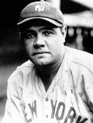
Does the NY yankees has just the logo of two letters on the cap ?

Or does it has several stars, the full name, some color, some other logo, the badge, moar logo all on the cap ?


Please get the point. Its juventus clothing thats subtile, not a halfwit wearing jerseys everywhere

- - - Updated - - -

Dru: unleashed

- - - Updated - - -


Lacoste? :boh:
I dont like a Polo that suggests i like a good ramming down my anus frequently mate
 

Cronios

Juventolog
Jun 7, 2004
27,519
This logo feels like a Padoin loan with a mandatory right to buy.
It has many disadvantages and a few positives.

-It lacks character, the bull gave us character, a strong animal for a strong team, black as we are in a white fond.
-The golden line and the golden crown, also had its double symbolism, like the bull, it also was a symbol of our city, our tradition, our glorious history and a reminder than our team is destined to hold the crown of serie A. Gold oozes or royalty, wealth and prestige, the effect of being stripped from our crowns reflects quite the opposite...
-Its asymmetrical, uneven, unnatural and illogical, why the double J, we are Jujentus, or Jjuventus? or just having spelling issues? It looks cheap, poorly thought and amateurly executed...

+its black and white, only few other teams could follow suit and play with the letters, which are mostly black in a white fond, colored letters are by default childish and unnatural. Imagile how stupid a blue B, on red fond, Barcelona new logo, would look!
+the letters double for our characteristic stripes, is the most clever part of the new symbol.
+severing the ties with our past also means we are now too humble to be compared with the team that used to challenge for and win European titles and winning a serie A crown does mean anymore what it used to.
 

PedroFlu

Senior Member
Sep 20, 2011
7,166
Another wonderful, myopic post


Localized thinking as it gets. You obviously do not grasp the concept, goal of globalization and the acquisition of new diverse supporters that 'support' in more ways than filling the curva.


All moves that person/business makes is a risk. The fact that you continue to feel that the change is not right is indication of your limited knowledge and understanding. Perhaps you should only stick to watching old matches of squads that make you feel reminiscent of a "simpler, better time" when 40+ yr old italian men sat in the stands and cheered on the club.


Yes, you're right. This has the potential to end horribly. It might end up in the club dissolving and a nuclear winter to follow. I fear the worst for the 40+ year old italians the most

Now run home and get your shinebox
"filling the curva". I'm talking about millions of Italian supporters.

You haven't actually presented a real argument, so conversation is over.
 

lgorTudor

Senior Member
Jan 15, 2015
32,951
When talking about Yankee caps pls consider that they haven't changed their logo for a century. The caps and their jersey have always looked the same. I bet this is also a reason why they are so popular - a well matured brand


PedroFlu

Senior Member
Sep 20, 2011
7,166
I wonder how many more pages will be filled with people not getting the point of this logo.


They wanted a slick logo that is simple and recognisable, that you can market in leasurewear, designer clothing and accecories.


Does the NY yankees has just the logo of two letters on the cap ?

Or does it has several stars, the full name, some color, some other logo, the badge, moar logo all on the cap ?


Please get the point. Its juventus clothing thats subtile, not a halfwit wearing jerseys everywhere

- - - Updated - - -


I dont like a Polo that suggests i like a good ramming down my anus frequently mate
The point is: couldn't it be done with this logo as a secondary brand? An exclusively commercial brad, separated from the sports brand?

If the point is to refer the brand to something more than football - where people could buy stuff to go to work, go out, etc, without immediately relating to football, why should this very brand be in the sportive kit?

Just make a brand specifically to this kind of purpose and maintain the original emblem on the kits.
 

.zero

★ ★ ★
Aug 8, 2006
82,813
"filling the curva". I'm talking about millions of Italian supporters.

You haven't actually presented a real argument, so conversation is over.
Wow you really aren't that bright. I wasn't presenting an argument. Perhaps you should try comprehending what you read once you clear the hurdle of reading itself.

You have missed the point again. Once with the point of the entire branding change, and now with my posts.


- - - Updated - - -

When talking about Yankee caps pls consider that they haven't changed their logo for a century. The caps and their jersey have always looked the same. I bet this is also a reason why they are so popular - a well matured brand

Actually they have. I'm also working on a project right now to help further rebrand several MLB clubs

http://www.sportslogos.net/logos/list_by_team/68/New_York_Yankees/
 

PedroFlu

Senior Member
Sep 20, 2011
7,166
Wow you really aren't that bright. I wasn't presenting an argument. Perhaps you should try comprehending what you read once you clear the hurdle of reading itself.

You have missed the point again. Once with the point of the entire branding change, and now with my posts.


- - - Updated - - -


Actually they have. I'm also working on a project right now to help further rebrand several MLB clubs

http://www.sportslogos.net/logos/list_by_team/68/New_York_Yankees/
I'm willing to discuss the matter.

But with someone else. You're like a chimp trying to troll or mock. Don't care.
 

Cronios

Juventolog
Jun 7, 2004
27,519
Jesus, judaism, Jack from the Knave facecard, were too fierce of a competition and thats we prefered to compete with the Swedish jj band, instead...

hmm, could still be a hiiden message, JoungerJuve, JewishJuve, pJanic'sJuve, Jianniagnelli'sJuve, JaguarJuve, JihadJuve...
 

JCK

Biased
JCK
May 11, 2004
125,381
This logo feels like a Padoin loan with a mandatory right to buy.
It has many disadvantages and a few positives.

-It lacks character, the bull gave us character, a strong animal for a strong team, black as we are in a white fond.
-The golden line and the golden crown, also had its double symbolism, like the bull, it also was a symbol of our city, our tradition, our glorious history and a reminder than our team is destined to hold the crown of serie A. Gold oozes or royalty, wealth and prestige, the effect of being stripped from our crowns reflects quite the opposite...
-Its asymmetrical, uneven, unnatural and illogical, why the double J, we are Jujentus, or Jjuventus? or just having spelling issues? It looks cheap, poorly thought and amateurly executed...

+its black and white, only few other teams could follow suit and play with the letters, which are mostly black in a white fond, colored letters are by default childish and unnatural. Imagile how stupid a blue B, on red fond, Barcelona new logo, would look!
+the letters double for our characteristic stripes, is the most clever part of the new symbol.
+severing the ties with our past also means we are now too humble to be compared with the team that used to challenge for and win European titles and winning a serie A crown does mean anymore what it used to.
What did I just read? and why did I read it?
 

Hust

Senior Member
Hustini
May 29, 2005
93,703
Another wonderful, myopic post


Localized thinking as it gets. You obviously do not grasp the concept, goal of globalization and the acquisition of new diverse supporters that 'support' in more ways than filling the curva.


All moves that person/business makes is a risk. The fact that you continue to feel that the change is not right is indication of your limited knowledge and understanding. Perhaps you should only stick to watching old matches of squads that make you feel reminiscent of a "simpler, better time" when 40+ yr old italian men sat in the stands and cheered on the club.


Yes, you're right. This has the potential to end horribly. It might end up in the club dissolving and a nuclear winter to follow. I fear the worst for the 40+ year old italians the most

Now run home and get your shinebox
:tup:

:D
 

Users Who Are Viewing This Thread (Users: 0, Guests: 20)