New logo (2 Viewers)
- Thread starter Tak!
- Start date
More options
Who Replied?


Nah we are quite bit behind and even if we doing well trying to get closer it's more likely they will widen the gap rather then us closing in let alone surpassing.
Barca and Real are insane marketing machines that's unbeatable, and EPL doesn't matter how much they fail, they will continue to shit pounds. Their total salary is double that of Serie A, whos closest league on that regard. This figure will continue to go up and not down in Juves favour.
Skickat från min SM-G930F via Tapatalk
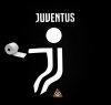
The whole idea of the logo is simplicity. I don't get all these photoshops that destroy the main strength of the logo. It's also good that it needs to be looked at for a moment to spot everything in it like the shape of the Scudetto badge. These photoshops just try to force feed people what is already there, completely pointless adding the outer edge for example.
This. So much fucking this.
People adding like 3 different aspects to the logo....

It's not a coincidence after a Years work the logo looks simplistic. Some high end designer didn't do it at the last second after fucking around on microsoft fucking paint for an hour. It's supposed to be a fucking minimalist design, just like google just like Mcdonalds, just like *Insert world renowned car badge logo here* just like facebook, just like Nike, Adidas, Pepsi etc.
As soon as you fuck around with it and add the clubs name spelled out, and a fucking irrelevant bull you ruin the idea. And it's just a new badge.
This move isn't about getting a nice new football club crest, it's a marketing move. And these edits shit all over the entire point of the move.
I am far from an expert in regards to marketing but holy fuck use some common sense, or at least go to a marketing 101 for dummies night class.


This. So much fucking this.
People adding like 3 different aspects to the logo....
It's not a coincidence after a Years work the logo looks simplistic. Some high end designer didn't do it at the last second after fucking around on microsoft fucking paint for an hour. It's supposed to be a fucking minimalist design, just like google just like Mcdonalds, just like *Insert world renowned car badge logo here* just like facebook, just like Nike, Adidas, Pepsi etc.
As soon as you fuck around with it and add the clubs name spelled out, and a fucking irrelevant bull you ruin the idea. And it's just a new badge.
This move isn't about getting a nice new football club crest, it's a marketing move. And these edits shit all over the entire point of the move.
I am far from an expert in regards to marketing but holy fuck use some common sense, or at least go to a marketing 101 for dummies night class.

The problem is that our simplicity sucks. If it looked allright everybody wouldnt not say a word, but unfortunately it's not like that.
The more you add to the logo, the more complex it becomes the more it defeats the point.
People who don't like this logo, probably don't like any similar minimalist logos. But at the end of the day you can't have both. You either have a really personalised, complex logo with 20 different things going on that appeals to nobody outside of the current fanbase, or you can attempt to create a recognisable brand. Pick one.

Nah we are quite bit behind and even if we doing well trying to get closer it's more likely they will widen the gap rather then us closing in let alone surpassing.
Barca and Real are insane marketing machines that's unbeatable, and EPL doesn't matter how much they fail, they will continue to $#@! pounds. Their total salary is double that of Serie A, whos closest league on that regard. This figure will continue to go up and not down in Juves favour.
Skickat från min SM-G930F via Tapatalk
Agree with what you said, in hindsight it's a tough task almost virtually impossible to catch up. Them TV deals in EPL are just too much. One step at a time for us but let's just aim to move a place or two above on the rich ladder.
And people wonder why EPL shits money
Tune in to a Sky covered PL game watch the glorious HD video packages, and presentation it gets.
Watch even a large Juve game in a foriegn country, you get one quiet creepy sounding commentator whispering into his microphone with shit coverage and some American at half time raping the players names with bad pronunciation
If you were new to football, and you watched United - City on Sky Sports then Juve - Whoever on some shit network you would assume we were in a lower league with the standard of presentation. It's embarrassing.
- - - Updated - - -
Exactly, our logo shits all over them. Yet show anybody who's ever used a computer in any country those logos and they will know what the fuck it means.
Tune in to a Sky covered PL game watch the glorious HD video packages, and presentation it gets.
Watch even a large Juve game in a foriegn country, you get one quiet creepy sounding commentator whispering into his microphone with shit coverage and some American at half time raping the players names with bad pronunciation
If you were new to football, and you watched United - City on Sky Sports then Juve - Whoever on some shit network you would assume we were in a lower league with the standard of presentation. It's embarrassing.
- - - Updated - - -
Personally the FB and google Logo are boring a fuck. But guess what, everyone knows them and no one cares about how they looks.
I find ours beutiful btw, just it isnt a football crest of course.
I find ours beutiful btw, just it isnt a football crest of course.