Juventus Shirts 2020/21 (3 Viewers)

Status
Not open for further replies.

Stevie

..........
Mar 30, 2003
17,645
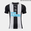
Dont like it. Too much of Newcastle going on in there..


Sent from my iPhone using Tapatalk
Newcastle is white stripes on black background and black shorts.

Our kit is basically the opposite unless you consider every Juve kit too much like Newcastles. They are always going to similar anyway but I would say this year's looks less than usual.
 

Buy on AliExpress.com

Osman

Koul Khara!
Aug 30, 2002
59,259
Smart long game marketing scheme, make a horrible current jersey half and half one, universally hated one, so you can reveal your true goal and design the following year. Easier for the masses to accept it.


It works, because this is way better then our current one. I just dont like the blank white back, but almost every shirt I dont like how they do the back.
 

Stevie

..........
Mar 30, 2003
17,645
Not this kit. But i recall their old kids ( and i mean ones back in their Alan Shearer heyday ) having a similar black and white with golden text look.


Sent from my iPhone using Tapatalk
You could say the same about our old kits too we've had gold text and sponsors before.

Ironically some of the best kits we've ever had in the 90s look more like Newcastle Kits that this one.
 

campionesidd

Senior Member
Mar 16, 2013
15,274
You could say the same about our old kits too we've had gold text and sponsors before.

Ironically some of the best kits we've ever had in the 90s look more like Newcastle Kits that this one.
Yeah, there's always going to be an overlap, especially if we compare recent kits with older ones and vice versa.
For example, the 3rd and 4th kits I posted look very similar to Juve's 2014-15 and 2017-18 jerseys.
 

juventus4life

Senior Member
Apr 21, 2012
3,955
faded stripes mostly and while I am not against gold in general the combo of gold with faded stripes. It just looks shit imo, its ugly and usually our jerseys look much better
I actually like the current one. Bold. Unique with a subtle remind of our original pink jersey that not all the fans know. The new jersey, on the other hand, looks like a half baked product.
 

JuveJay

Senior Signor
Moderator
Mar 6, 2007
72,294
back is gorgeous, font is nice and black

the front tho, especially the gold stripes :inter:
See, I don't like those stripes across the shoulders. It reminds me of another sport.

I do like the font and the proper 'tuning fork Y'.

I'm a fan of white/white for our combo (traditional Juve) but with the faded black stripes and gold this one is a little too light and Real Madrid-esque, so it will look more like a Juve kit with the black shorts.
 
Status
Not open for further replies.

Users Who Are Viewing This Thread (Users: 0, Guests: 2)