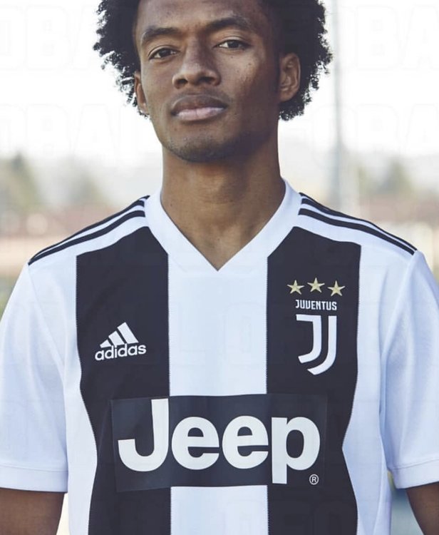
As a designer myself I can only think of one reason for limiting the stripes. The positioning of logos, badges and crests.
We are likely to have a whole bunch of extra badges added to the one Cuadrado is wearing there.
Simplifying is the way forward. Gone are the Kappa days of maximalism and very little gestalt.
I also note how the kit is dominantly white. This is a good choice as well, as it's easier to color compliment the opposing team to a dominantly dark kit.
It makes for a clear distinction. It must be a challenge to balance a Juve kit as it is equally white and black originally.
At first I wasn't happy with this kit, but as with the logo it's something we eventually all will come to appreciate.
I do not appreciate the Jeep logo on the chest. I wonder why it must be added to the material afterwards and not designed from the get go. I would have loved to see the black square in the shirt. In the same cloth material, and then the letter logo print on top of that.

 Buy on AliExpress.com


 I think we all know what this high end brand Palace was trying to do....