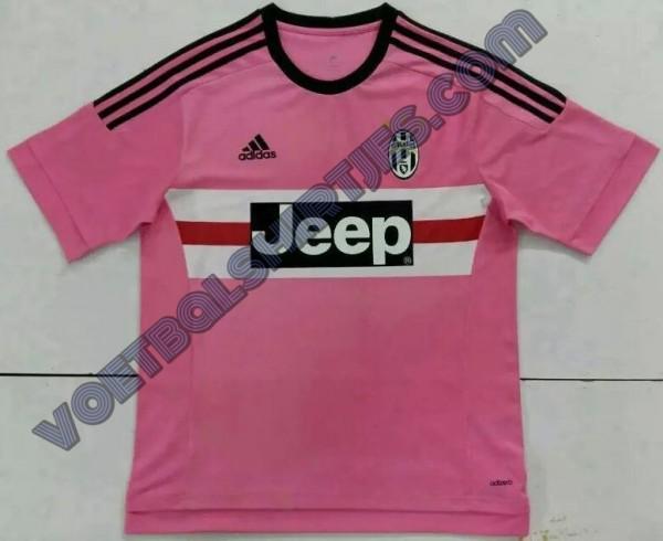
Our away kits for the next six seasons are going to be way better than the home kits, I'll guarantee that.

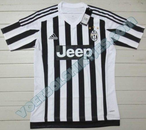
It's no surprise that their plain kits look better than their striped ones.
 Buy on AliExpress.com
Buy on AliExpress.com
Buy on AliExpress.com

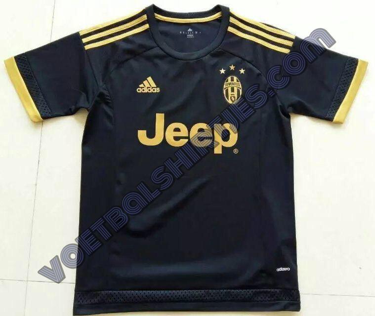


 Though I'll admit that Adidas are great at designing Bayern's away and third jerseys.