Juventus shirts 2014/15 (11 Viewers)

Status
Not open for further replies.

TheLaz

Senior Member
Oct 6, 2011
5,275
Not a fan of the font.

'R' and 'A' looks like two different fonts.
Don't like the ziggy stripes either..

Number with opacity on flips looks cool though!
 

Siamak

╭∩╮( ͡° ͜ʖ ͡°)╭∩╮
Aug 13, 2013
15,024
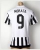
It doesn't make sense to place the silver star above the Coppa badge while the golden stars is above our crest. What happens when we no longer have the badge on our shirt?
Our shirt would be nice if put silver start next to the gold stars instead puts silver start above the coppa badge
Four starts on our shirt without the coppa badge
 

baggio

Senior Member
Jun 3, 2003
19,250
I think the pink will look better on the pitch than they do in that photoshoot. The black and gold is very sharp although that seems more Meelan for some reason than it does Juve. Also, the coppa and Italian scudetto shield are going to be a bit jarring on that black and gold combo IMO.
 

Cirillo

Senior Member
Nov 10, 2009
3,034
I wonder if now that we're with Adidas if we'll announce our next season playing strip before the end of the season in following seasons (obviously we're still contracted to Nike so we can't do it this year)?
 
Status
Not open for further replies.

Users Who Are Viewing This Thread (Users: 0, Guests: 9)