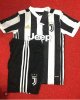
The best – Juventus home
Had we not restricted each side from appearing on the ‘best’ or ‘worst’ more than once, Juventus would own the No.1 and No.2 slots here. Their yellow and blue away kit is gorgeous but their home shirt is simplicity itself.
The clean lines flatter the wearer, and the new Juventus logo fits in perfectly with the designed. The Adidas logo slips in neatly between black stripes in a gold colour that matches the stars that symbolise Juve’s 33 Serie A titles.
And despite being a corporate sponsor the Jeep logo compliments the rest of the shirt in an unobtrusive way. The round collar tops off a simple button up design that allows for the shirt to worn in a casual ‘look at my chest hair’ mode, which is always useful for the hirsute.
On the back, the flat black panel allows the name and number to really pop off the shirt rather than have to fight for attention with the stripes (and allows the shirt to comply with UEFA regulations by default).
This is gorgeous. Regardless of the quality of their football next season, in 2017/18 Juventus will win Serie A in greater style than they ever have before.
 Buy on AliExpress.com


 @Wittl
