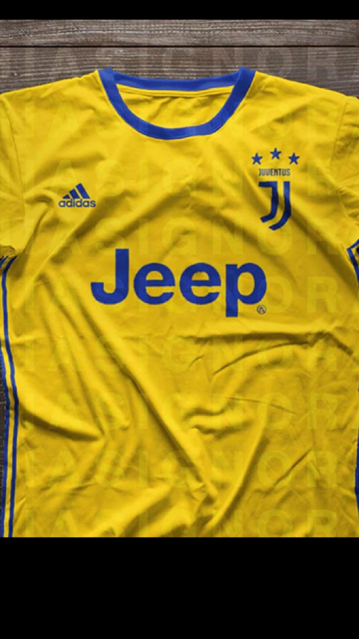
Juventus Shirts 2019/20 (38 Viewers)
- Thread starter alexjuventino
- Start date
- Status
- Not open for further replies.
More options
Who Replied?If they made a distinction between the Brand logo and the Football one I'd have been happy. Good initiative to help us grow, I can appreciate that, but the old logo was perfect and one of the most recognized in football. As a football crest, this logo matches this year's soulless Juventus 2016-2017.
How on earth did it take 18 months to design this I will never know. The marketing teams need firing they can take Sturaro and all our other deadweights with them
I understand the reasoning behind the change, but personally I like the old look of the previous logo. It had history to it.
Trying to modernize I guess, just as we'll have to do with our squad very soon as well unfortunately. Even if we don't like the logo, at least it shows our board is looking towards the future.
Trying to modernize I guess, just as we'll have to do with our squad very soon as well unfortunately. Even if we don't like the logo, at least it shows our board is looking towards the future.
- Status
- Not open for further replies.


