Overall problems:
-stars aligment: I want them to be on the same level
-stars too pale: there needs to be a stronger contrast between stars and background
-stickers, stickers everywhere. This better be "fan issue/player issue" variation to minimize jersey weight
-shoulder stripes: Adidas are forcing their stupid trademark feature upon everybody without asking
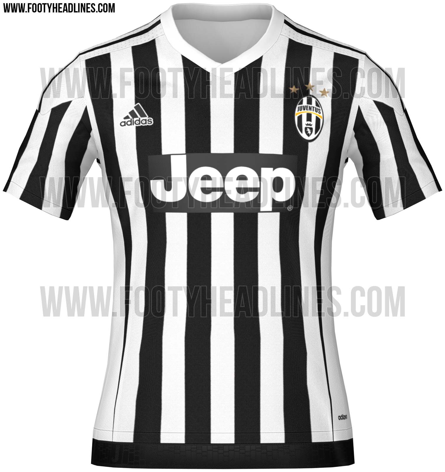
Home
- no juventus stripes at sides and back: This looks like somebody in a white shirt was run over by a truck while sleeping on the road
- v-neck: I disapprove of this phaggotry
+ I enjoy the thin stripes, however the overall design is ruined by aforementioned issues
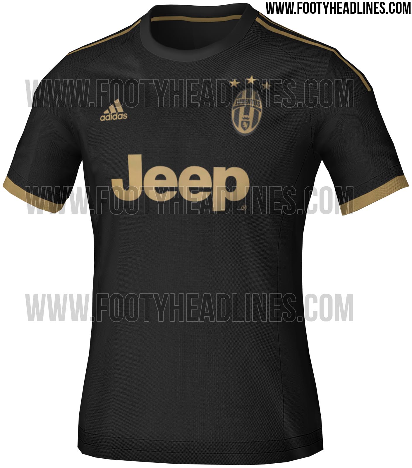
Black&Gold
- gold: this is not a colour for Juventus FC. We are not Real Madrid or Milan. ultra cheap style
+ despite the horrific coloring the jersey looks homogenous and fluent
Pink
- This white-dark pink-black box is unbearable to the human eye. Jersey should have been pink with black "Jeep" text.
+ I like the base pink shade
Summed up: A dreadful set of kits to hurt the eye of anybody who dares looking


 Buy on AliExpress.com