Juve 2009-10 kits(speculation, pics...) (3 Viewers)
- Thread starter Mark
- Start date
More options
Who Replied?
dislike both (home away) i wanted collars, and finally balck shorts!! But..
OMG i just saw it Its.. i have no words. Such feelings that guys from nike just load some football game and choose templates by random.
We are using black shorts only when opponent using white. Examplse : Real, Roma, Milan, Napoli, Genoa.
But i remember in one match (vs Lazio i guess, but can mistaken) we and Lazio used white shorts - it was some kind of mistake i guess.
They will always suck...
When the yellow names were was barely visible , the font they were written with was perfect. Now that we can see the deep yellow, they make the font suck. nike insist on doing something each year
But after seeing the Man Utd jersey for the coming season I'm grateful
When the yellow names were was barely visible , the font they were written with was perfect. Now that we can see the deep yellow, they make the font suck. nike insist on doing something each year
But after seeing the Man Utd jersey for the coming season I'm grateful
Its.. i have no words. Such feelings that guys from nike just load some football game and choose templates by random.
i guess we will use black shorts sometimes no? like this season against real.
But i remember in one match (vs Lazio i guess, but can mistaken) we and Lazio used white shorts - it was some kind of mistake i guess.

They will always suck...
When the yellow names were was barely visible , the font they were written with was perfect. Now that we can see the deep yellow, they make the font suck. nike insist on doing something shitty each year
But after seeing the Man Utd jersey for the coming season I'm grateful
When the yellow names were was barely visible , the font they were written with was perfect. Now that we can see the deep yellow, they make the font suck. nike insist on doing something shitty each year
But after seeing the Man Utd jersey for the coming season I'm grateful


")
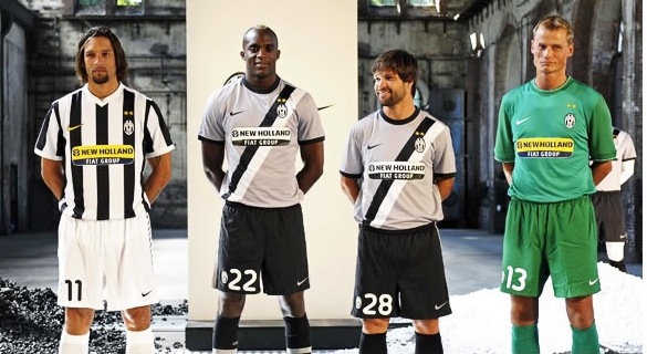
i'm loving the home kit the more i look at it. i think there's some sort of retro feel to it, with the white v-neck and white borders on the sleeves. the simple design looks real good. i just wished they'd sort out the fonts for the names and letter's. they look somewhat cartoonish.
on another note, i've just seen arsenal's away kit, and the collared shirt looks like the best of the current nike 2009-2010 crop of jersey's.
on another note, i've just seen arsenal's away kit, and the collared shirt looks like the best of the current nike 2009-2010 crop of jersey's.
They will always suck...
When the yellow names were was barely visible , the font they were written with was perfect. Now that we can see the deep yellow, they make the font suck. nike insist on doing something shitty each year
But after seeing the Man Utd jersey for the coming season I'm grateful
When the yellow names were was barely visible , the font they were written with was perfect. Now that we can see the deep yellow, they make the font suck. nike insist on doing something shitty each year
But after seeing the Man Utd jersey for the coming season I'm grateful
by the way..the man utd new jersey does suck....but ours is really much better than the previous year...and surely hope the fonts are better