Juventus Shirts 2019/20 (13 Viewers)

Status
Not open for further replies.

Cirillo

Senior Member
Nov 10, 2009
3,034
where there's smoke there's fire. There has been too many suggestions of this abomination for it to be too far off the mark. It is actually a disgusting representation of this beautiful club :disagree:
 

Jem83

maitre'd at Canal Bar
Nov 7, 2005
22,865
A home kit without stripes is rather hard to accept. Was shocked when I saw this yesterday. But today it's already starting to grow on me :lol3:

Scudetto is a must, though, for it to look optimal.
 

Sad Statue

wannabe Bart Simpson
Mar 28, 2006
1,906
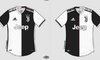
I like it, especially the home one. Looks like a shirt designed with us in mind, not just a generic design just painted black and white. The pink line is a nice hint to our history and overall it focuses on the black and white thing (I love how the white adidas logo is on the black background and the other way round for our logo).

Yes it's different than the usual stripped shirt. But, well we change. Our logo changed. Our transfer strategy changed. Our football brand is changing.
 
Status
Not open for further replies.

Users Who Are Viewing This Thread (Users: 0, Guests: 12)